Check out the live site here: https://www.truemods.com/
Keywords: UI design, interaction design, rapid prototyping, information architecture, A/B testing, marketing, growth and user research, metrics & analytics, strategy, content strategy and guidelines, web rebrand, product / project management, feature validation.
Introduction
I was called aboard to reinvent an entire shopping experience from scratch. I started alone with one developer, then eventually as the project scope increased new members were added. I led a team of two designers, photographers, and copy-writers, along with working with two front and back-end developers to launch a complex shopping site with hundreds of pages.
The initial problem started with a re-brand. Online-LED-Store was due for a make-over since the original shop was on Ebay, and then branched out after success to their own product using Magento as an e-commerce service a decade ago. With the introduction of general automotive accessories, Online-LED-Store were not just selling “LED”products anymore. This re-brand was needed to adapt to the current market to ensure the longevity, survival, and growth of the company.
While current customers were business owners and independent professionals outfitting work or emergency vehicles for their own pleasure, we needed to explore a general and friendlier brand and identity to broaden and spike interest for new and younger customers.
We have to let our shoppers know that this brand is the best for certain qualities (if not quality then price-point). Our shoppers have to believe that our shop is the safest bet, and safest choice for LED lighting and other LED related automotive products.
My Role, Initiatives, and Milestones:
• Lead a team to design & develop engaging content end to end from ideation to successfully shipping a full e-commerce experience for web to mobile responsive.
• Conducted usability studies to generate new goals and procure new learned data. Conducted user interviews to provide research and design direction, as well as developed and fine-tune personas.
• Created 20+ documentation for company collateral: stacks, design specs, guidelines, and content. Conducted user research. Implemented launch strategy.
• User feedback suggests a 100% customer satisfaction rate with the new launch.
• Analyzed user's checkout and shopping behaviours with analytics, surveys and interviews. Comparisons suggested increase of 20% in conversion rates, and double the revenue within Q4.
- Phase 1: Assumptions, Exploration, Generative Research -
Since I didn't know where to start. I started asking questions with the stakeholders, as well as company employees that dealt with the customers over-the-phone or in-person. After synthesizing these interviews, I created clusters from reoccurrence of themes to form my assumptions.
On my initial brief I presented that our shoppers, these "dude" or "dudette" folks-next-door types wanted to feel safe, guaranteed, and reassured that they had made the right choice when purchasing our product(s). Many of our users are volunteer medics or firefighters. They want a fluid and easy experience to save time and streamline their decisions making process, since their lives are already hectic, always on-the-go, with others on the line, time cannot be compromised.
I created and sent out a survey to existing account holders and potential participants. Plugged in results into a spreadsheet to see who matched our proto-personas. I then hand-selected five participants to interview and gather further insight to validate more assumptions.
From my qualitative data collection, my findings suggested four out of five disliked or do not care for new web design trends. They also felt bombarded by many e-commerce sites by too many options, visuals, advertisements, stating "it is annoying, distracting, and disorienting." Safety and emergency workers needed a direct route. Survey stated less than half of our users have little experience shopping online and preferred the older version of the website on Ebay. Regarding previous versions, the experience was overwhelming and slightly dated in screen flow and information architecture. Content did not address the "honest, respectable, down-to-earth, and trustworthy" interface and interactions for these Good Samaritans.
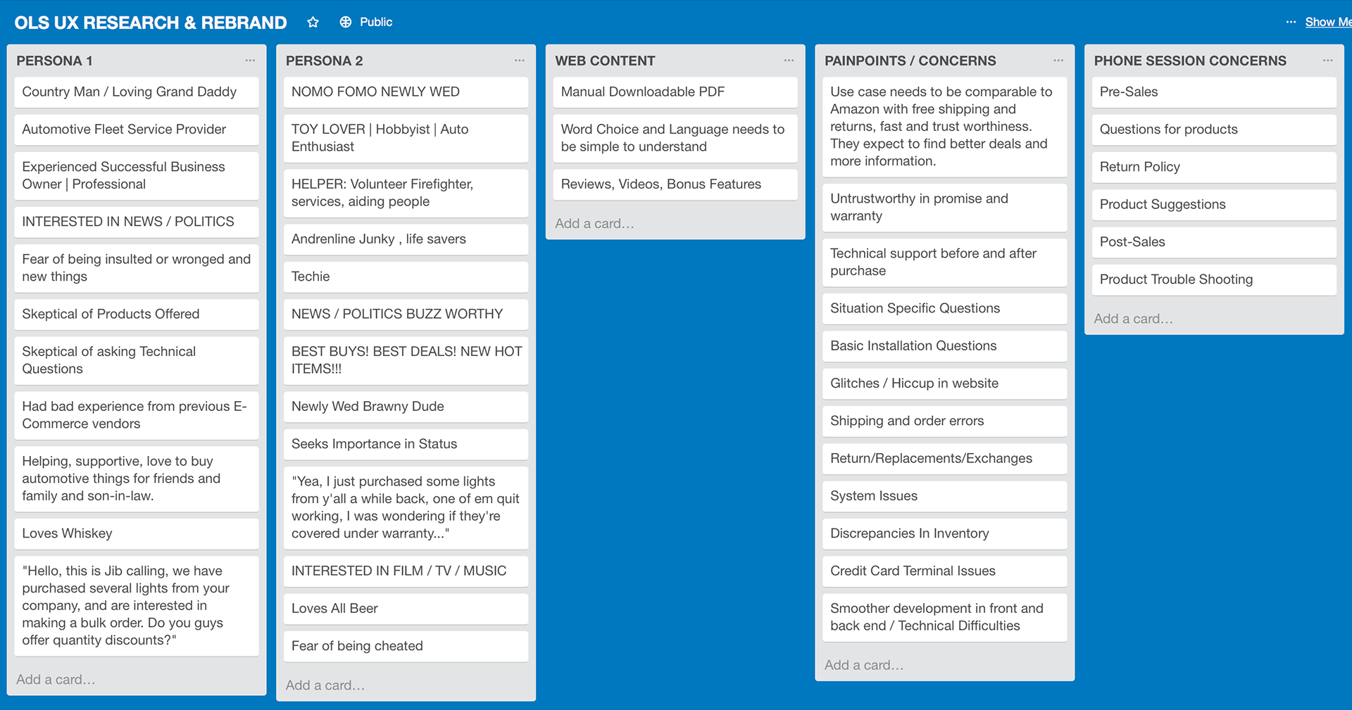
Developing Personas
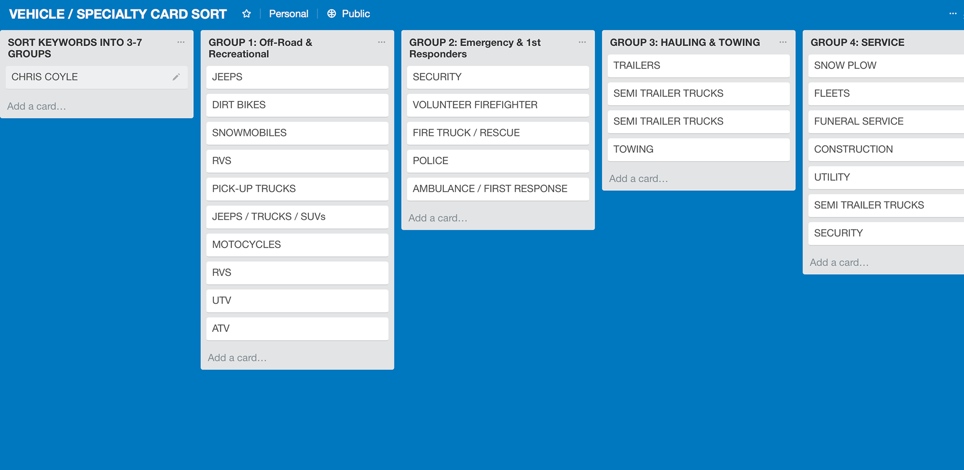
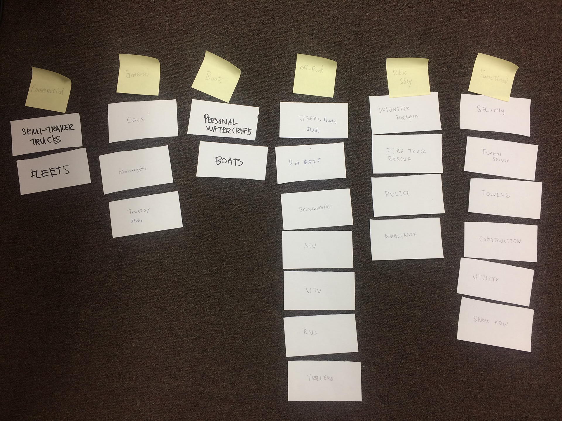
Closed Card Sort for Information Architecture Demo
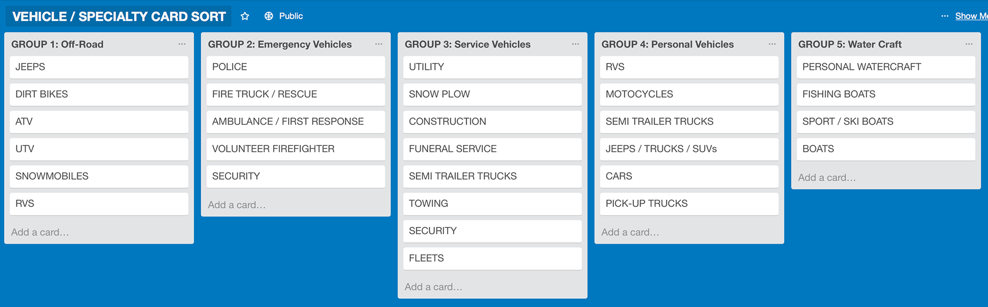
Closed Card Sort for Information Architecture Demo
Company Values
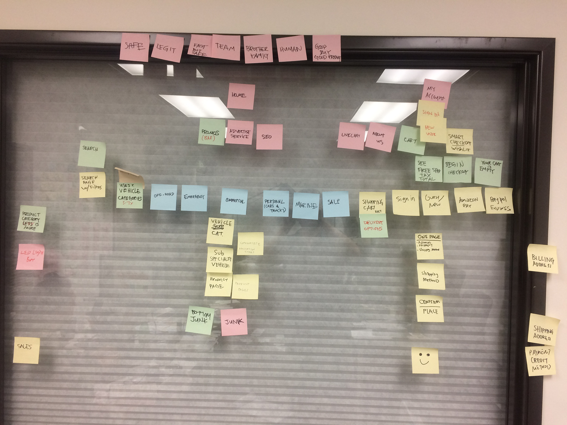
Site Map Ideation
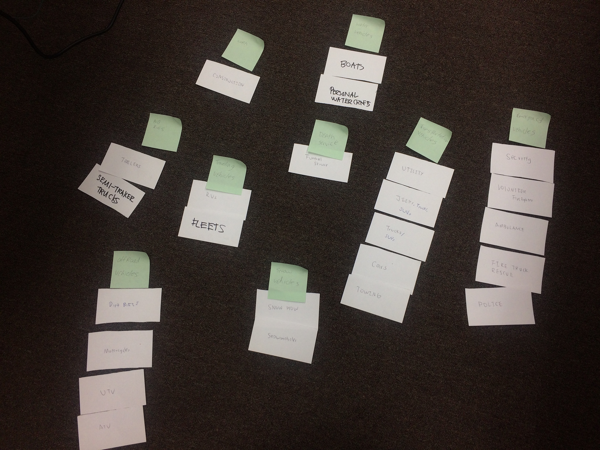
Open Card Sort for Information Architecture
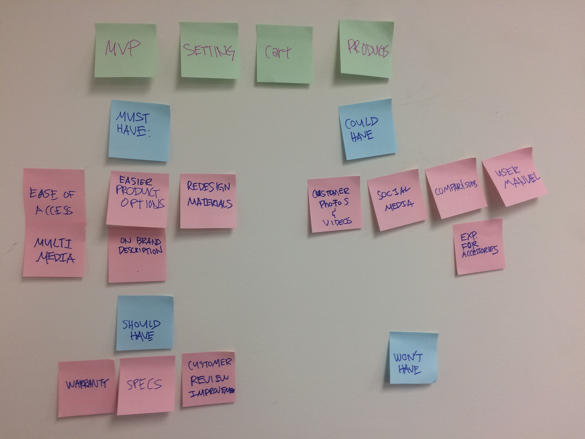
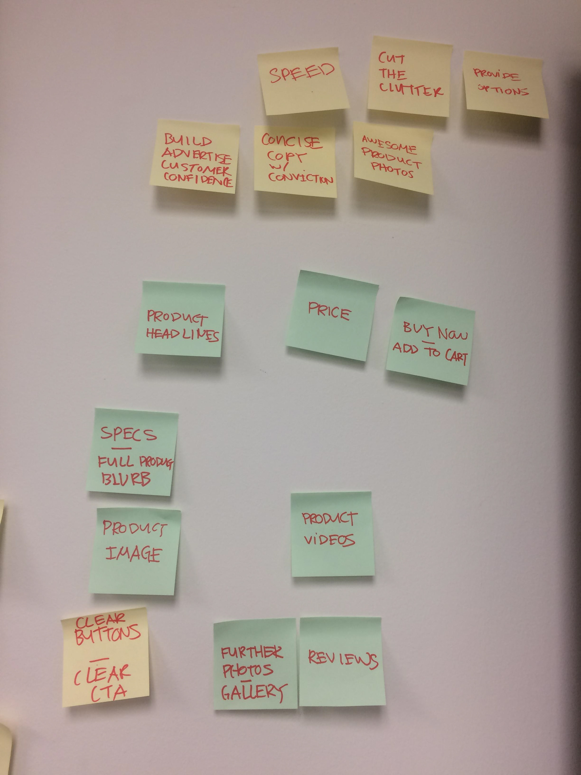
Features set fro M.V.P.
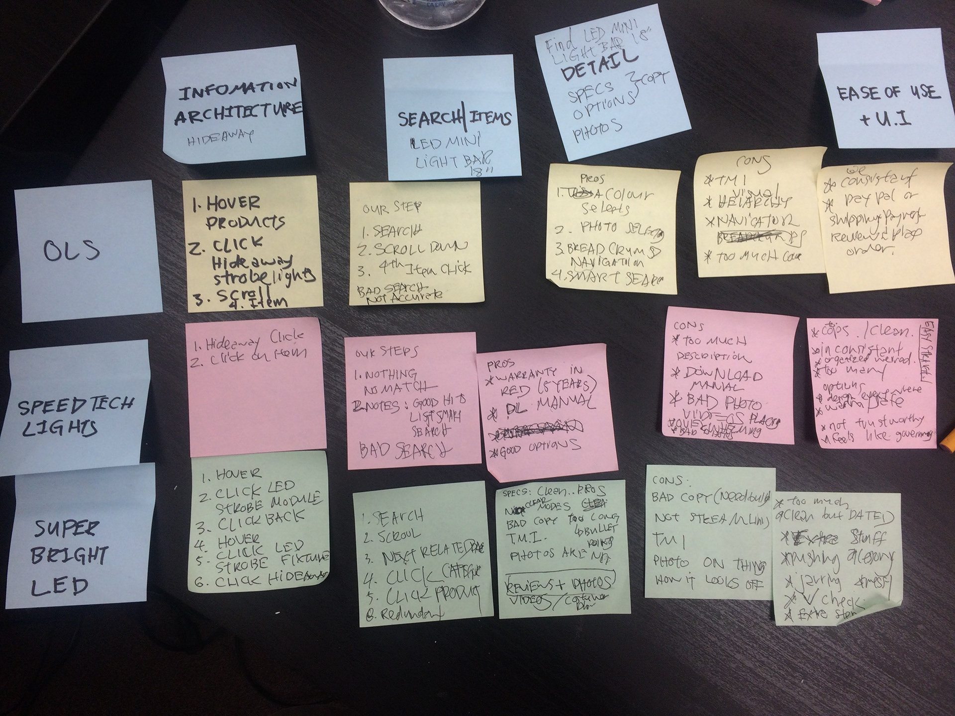
Quick Competitive Analysis

Open Card Sort for Information Architecture
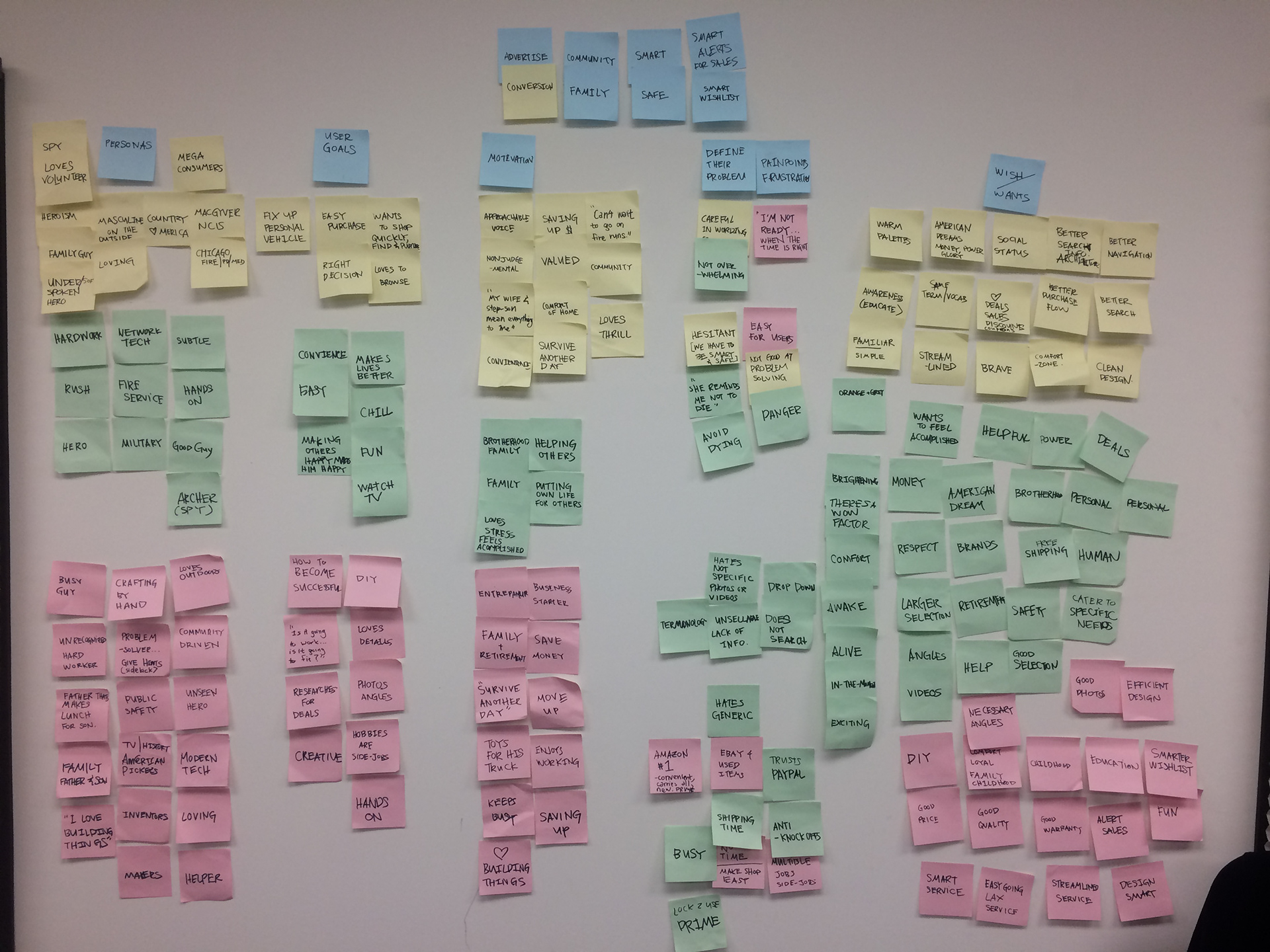
Research Synthesis from User Interviews
Problems Discovered
Problem 1:
Our site was dated, we need to update with a new product and a new experience that is smoother and accessible for people on-the-go. Key takeaways were to declutter, be honest, respectable, and down-to-earth. I tell my team that I imagine our tone and voice would be like a trusted hero's side-kick, a good pal, your neighbor.
Problem 2:
Via Google Analytics I found a high drop-off rate before check-out completion. So along with the new web experience we needed to devote some time experimenting with the checkout flow and options. Set up success metrics, add triggers to track what users were doing.
Problem 3:
Via Goggle Analytics, we found low user engagement and high drop-offs at homepage. Content strategy needed to be thought out so that we could provide the best content for a high majority of our users. Unsure if this was a content, usability, or visual design issue so we decided to update all.
Problem 4:
Most users prefer purchasing our products from our Amazon shop. I tried to tackle this problem by creating separate experiences, gave different use-cases, and incentives to differentiate Amazon from our personal shop. Amazon we targeted for Prime users. Our own web product provides more information, content, videos, news, customization of products and bundles, and research. I had to clarify the two shops without compromising revenue and user engagement.
- Phase 2: Brand Attributes, Project Priorities, Creating User Profiles -
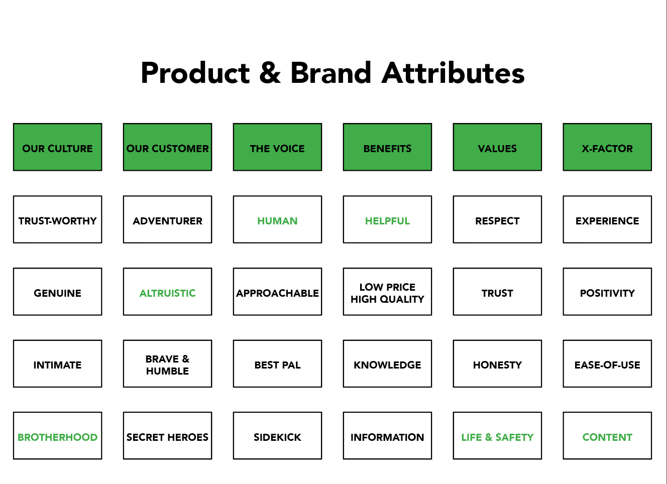
Discovered and implemented a direction for the product. Selections in green text were the most favored for both company and users.
Hypotheses
HYPOTHESIS FOR PROBLEM 2: CHECKOUT DROP OFF
Although sources cited that forcing and locking a customer into checkout could lessen drop-off rates, I wanted to challenge that. It seemed like black UX—locking a user in just seemed wrong. Based off our tight customer demographic, without proper care and attention it would hinder the online shopping experience for the entire industry. Amazon uses a method of fading out options at checkout but since we needed to keep a consistent look & feel through the screens, I believe by having a one page checkout, users would feel more stable and grounded. Users stated they felt alerted and unease towards the end when interactions and dramatic shifts triggered transitions or animations. Our current flow from shopping to checkout needed to be closely analyzed, updated, then tested by our target users.
By ensuring the customers their safety while addressing whatever concerns they may have before hand, before the checkout process, we will achieve an increase of completed orders. We will know this to be successful when we see a slight increase of checkouts rates and/or drop-offs closer to completion through comparisons with our analytics.
HYPOTHESIS FOR PROBLEM 3: USERS LEAVING AT HOMEPAGE
By cleaning up the homepage we will encourage the optimization of navigation, allowing users to explore other areas of the site. Making the entire site feel safe, comfortable, and easy to navigate through visuals, content, and information architecture, we will achieve a less stressful and less overwhelming e-commerce shopping experience. Doing so we will achieve lesser drop-off rates after our landing on the homepage. We will know this to be true with an increased engagement rate.
HYPOTHESIS FOR PROBLEM 4: USERS PREFER AMAZON, WHY BUILD OUR PRODUCT?
We are not trying to compete with our Amazon shop. So we need to distinguish certain use-cases to separate our online presence and Amazon store. Amazon is already a top preference for usability and also trusted by the mass public. It provides a general yet predictable and reoccurring pleasant shopping experience that make users want to return and also form a habitual intuition through connivence.
We need a better on-boarding process for users to sign up or sign-in to the OLS shop. We need to integrate deals, bundles, wholesale options, blogs, news, hot items, and coupons to our product. We will be benefiting from the separation of the two shops instead of competing with each other. Amazon’s convenience attracts to some customers while other folks may benefit from and be more satisfied with our personal shop. We will know this to be true when we see improvement in sales.
Research Plan Sample
Research Goals:
Discover problems dealing with the current OLS website while better understanding our user’s everyday work, personal goals and motivations, what they need and why they need it, and what pains them.
Audience:
A diverse pool of recent OLS users. Location doesn’t matter as much but age groups should be divided to track time and progress.
Methods:
• Company Assets: Internal Stakeholder Interviews, Customer Experience Insights, & Google Analytics
• 2x Customer Surveys
• 5x User Interviews
• 2x Customer Surveys
• 5x User Interviews
Hypothesis:
• I suspect major drop-offs due to unpleasant flows and visuals that may be hindering the completion of checkouts.
• Professionals desire to shop on a trustworthy and simple website to get what they want quickly and clearly.
• Individuals desire to shop best prices and deals, with clear specifications and details with smooth navigation.
• Professionals desire to shop on a trustworthy and simple website to get what they want quickly and clearly.
• Individuals desire to shop best prices and deals, with clear specifications and details with smooth navigation.
User Task:
Shop! Search and learn about products, inquire about products for hobby or professional needs.
User Goal:
Be content, and satisfied with their purchase—knowing they had enough content for their research and discussion making process.
- Phase 3: Design, Development, Pre-Launch -
After weeks of wire-framing, ideation, and white boarding, designers and company finally agreed on a direction. We all know how to and know how low-fidelity screens look like, and yup, it's not that visually pleasing. Please refer to older projects in the portfolio for examples of paper wireframes, lo to mid-fidelity wireframes, and prototypes.
Obviously we need to start somewhere, we had to just quickly build something that was usable so we have something to work with. After working with a branding team, I quickly mocked up how the new interface would look like based on what our research data provided.
Looking back we were borderline using the waterfall approach, a linear and safer way in software development. When we hit Q3, I stated the scope was too large and I was given a few new team members.
I eventually realized we're losing money and our designs are becoming dated each day we don't launch. So I compiled a few sprints for the dev and designers that would have enough features and functions for the M.V.P.
Within that month we launched. It was not perfect, but now we have a skeleton structure to work with and improve.
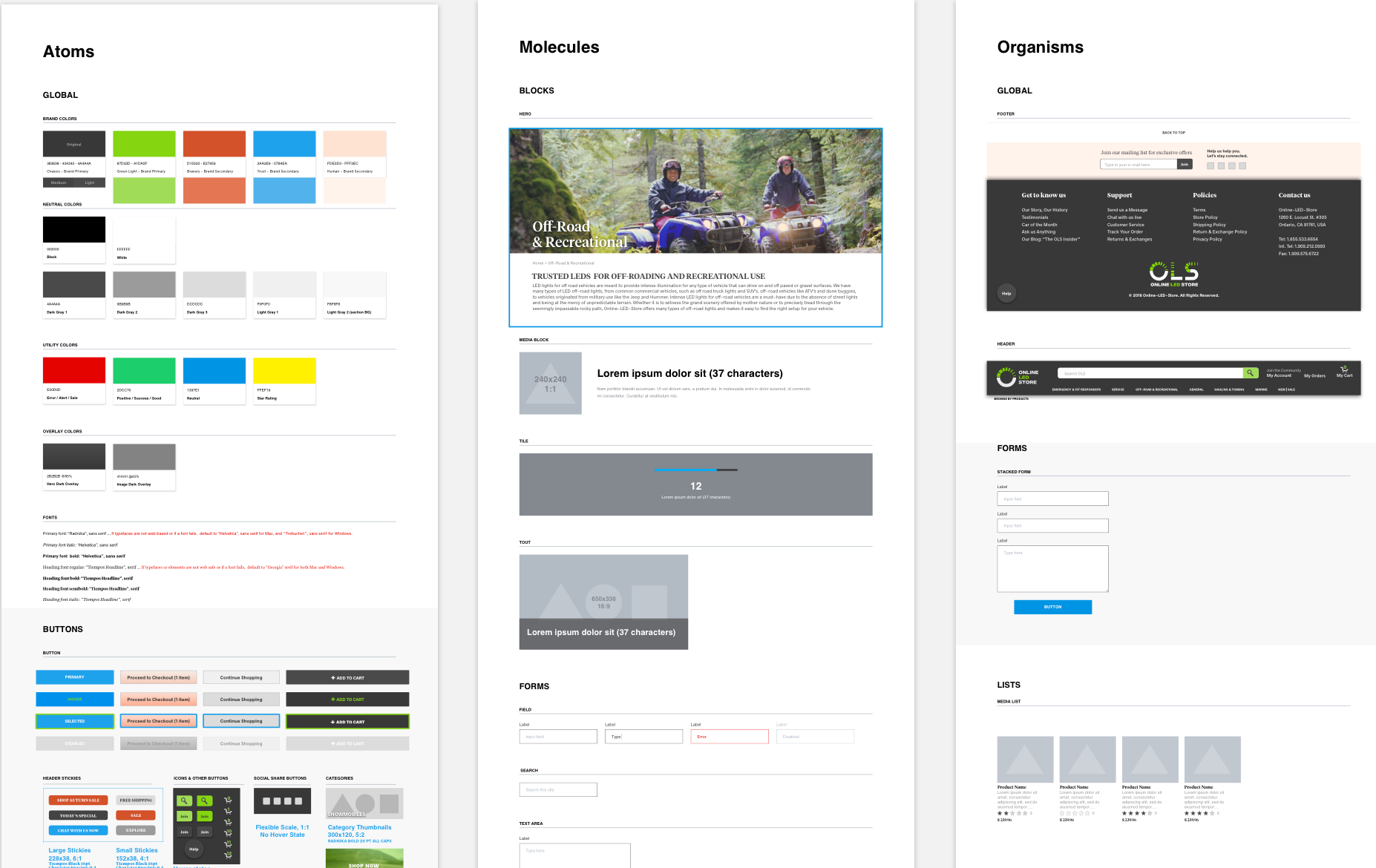
V1 Atomic Design and Guidelines
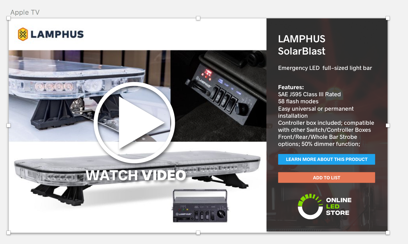
V1 Ten Ft. UI Conception
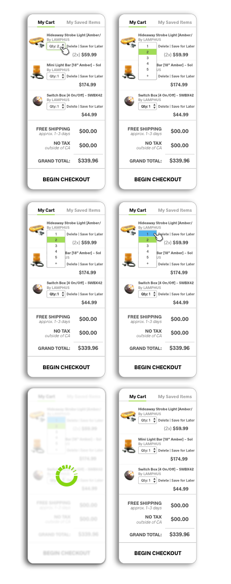
Feature Conception: Mini Cart
We explored this idea of having this "mini-kart." It presents itself like a hand basket, it's always on you so you know exactly what's in your shopping bag. It's supposed to bring a sense of safety and trust. It's easier to see what you have and how much you're spending right off the bat without clicking into a new cart page.
For version 1 launch, we scrapped this idea because of timing and it was labeled a "could have." Meaning it's a nice feature to have but it's not required for a full functioning product.
Storyboarding, Hover States, Drop-downs, Form Validation
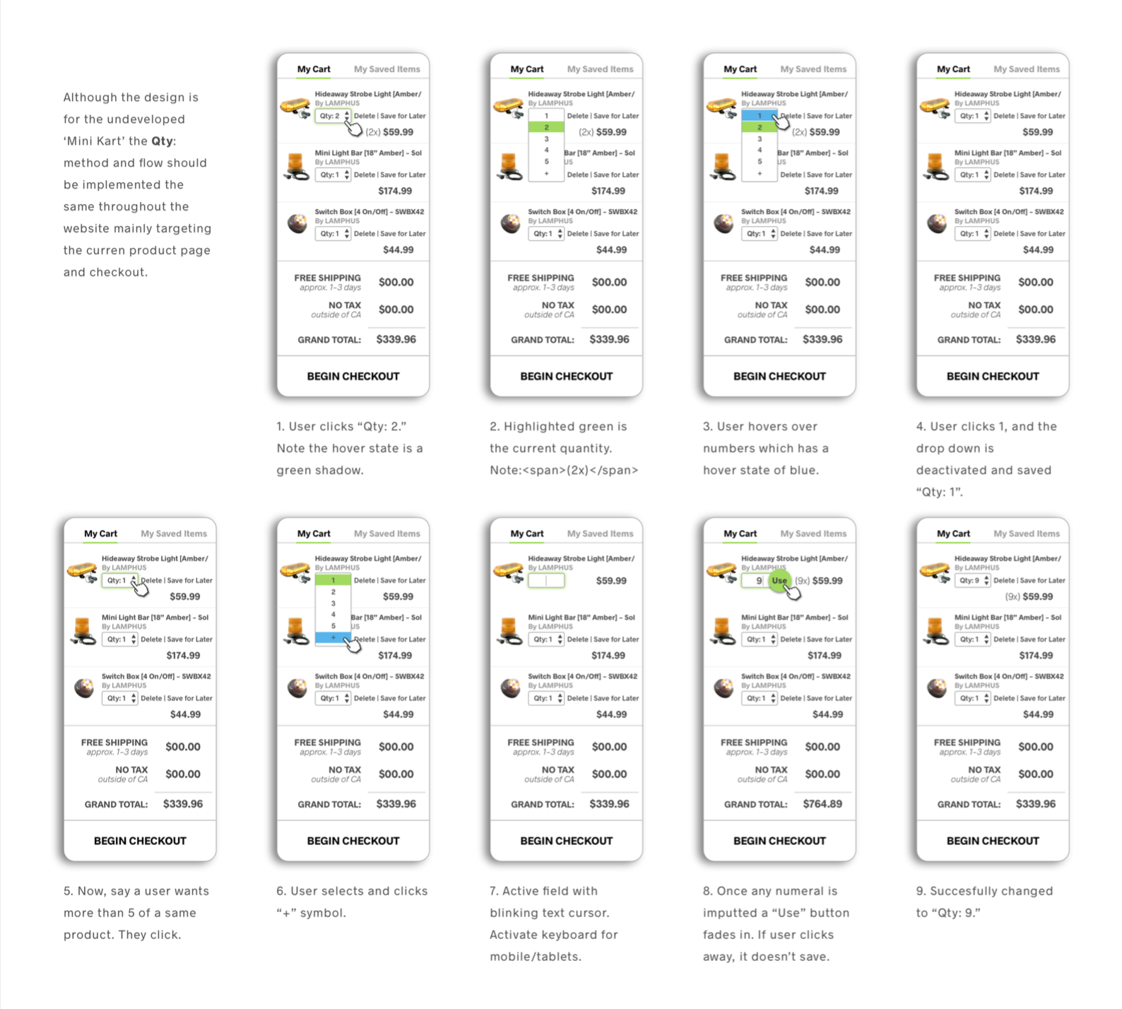
Mock-up interaction design of the "mini-kart" using AfterEffects
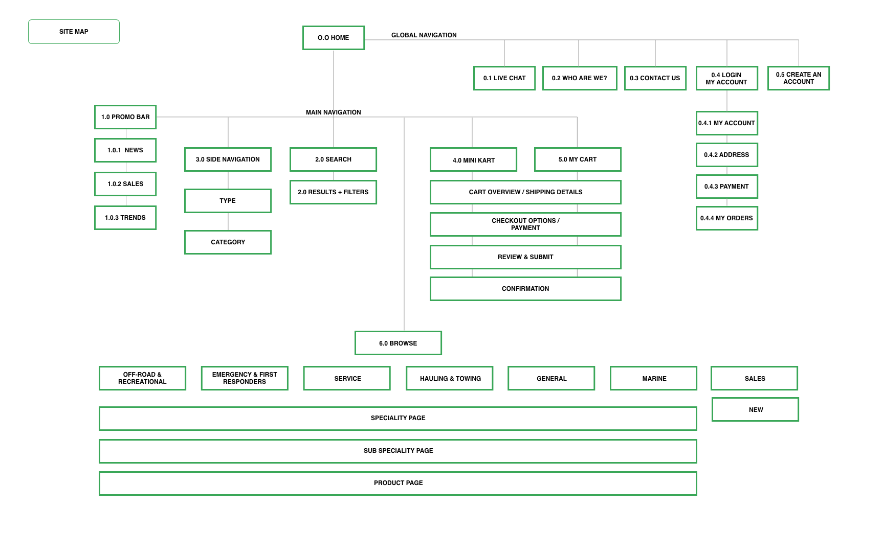
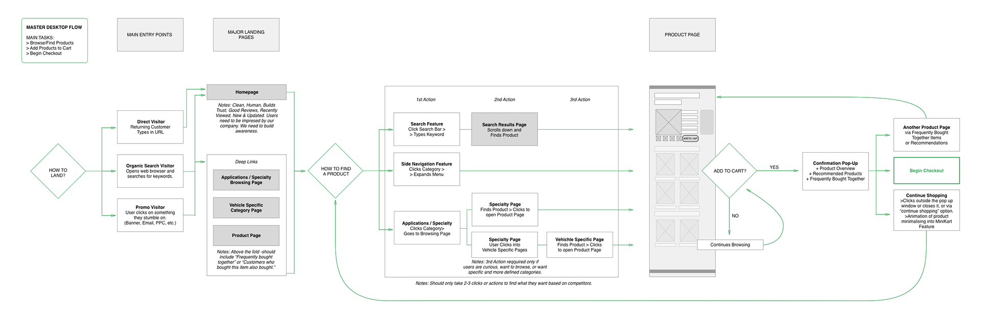
User Flow and Site Map Variations
User flows have been constantly changing throughout companies and scenarios. Below are a few variations of flows and maps done for a specific outcome and problem. The most important thing here for us was what was the most effective way of displaying what needed to be displayed to business owner and developers. What will help future designers iterate and create new material, content, features, etc.
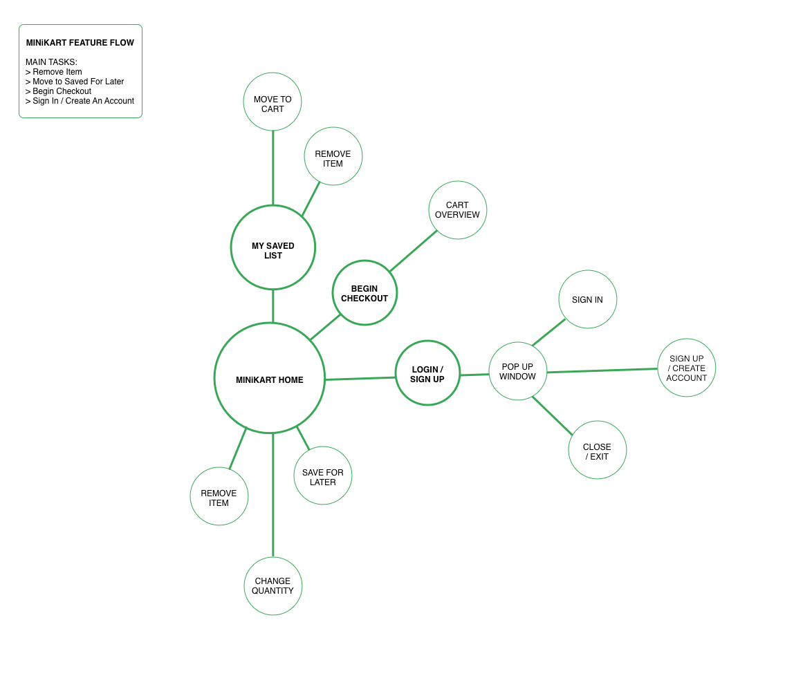
Hub v. Spoke
Since this was a small feature, similar to an application, a different method was used to display the scope of the feature.
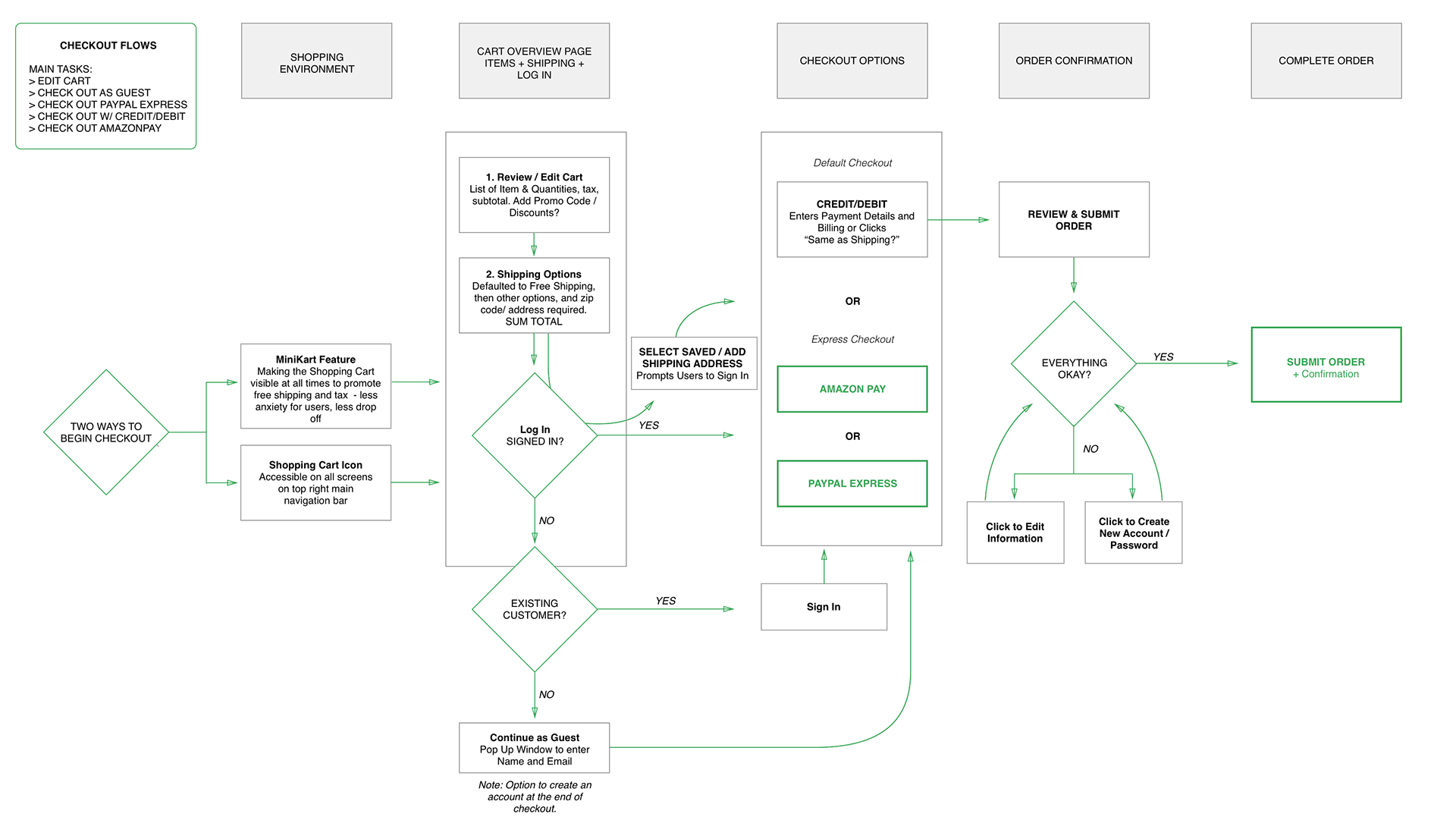
Checkout Flow Audit
After analyzing the drop-off rates at checkout using Google Analytics, a round of user interviews, and running a competitive analysis, we found that our users preferred less options, they preferred to see everything on one page, they were use to the habits and behaviors created by shopping with Ebay and Amazon, and preferred similar structures and methods. Connivence was a second factor, though older users still preferred old version of Ebay and Amazon, our hobbyist persona preferred Apple and PayPal. To find a happy middle ground was the challenge. Below suggests minor tweaks to improve the check out experience, receiving positive user feedback post-launch.
Some companies use hybrid work flows to show entry points. What the user sees versus what the user does.
High-level Customer Journey Hybrid Work Flow
What the user sees versus what the user does or feels.
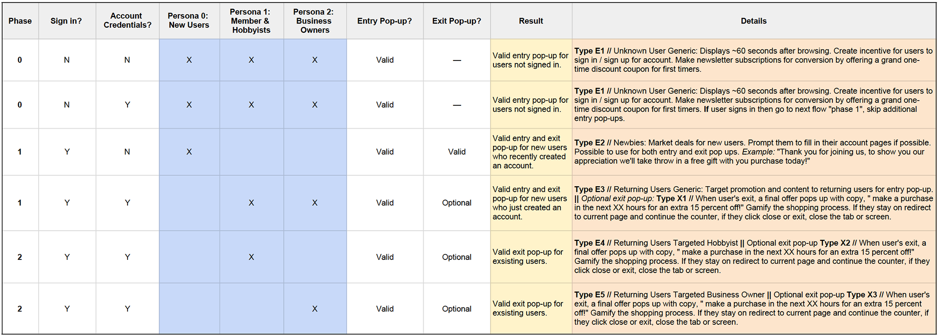
Subscription Flow, Reference Mapping Sample
This references a few scenarios using if statements. Depending on who the user is, and if we have data on the existing user, the user will then receive a specific modal announcement or certain offers geared towards their status of conversion, personal interests, and profession.
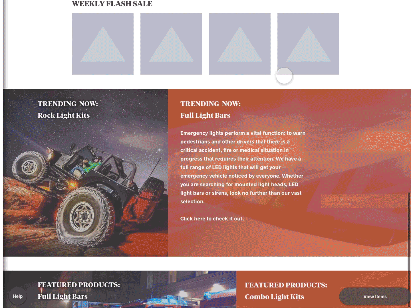
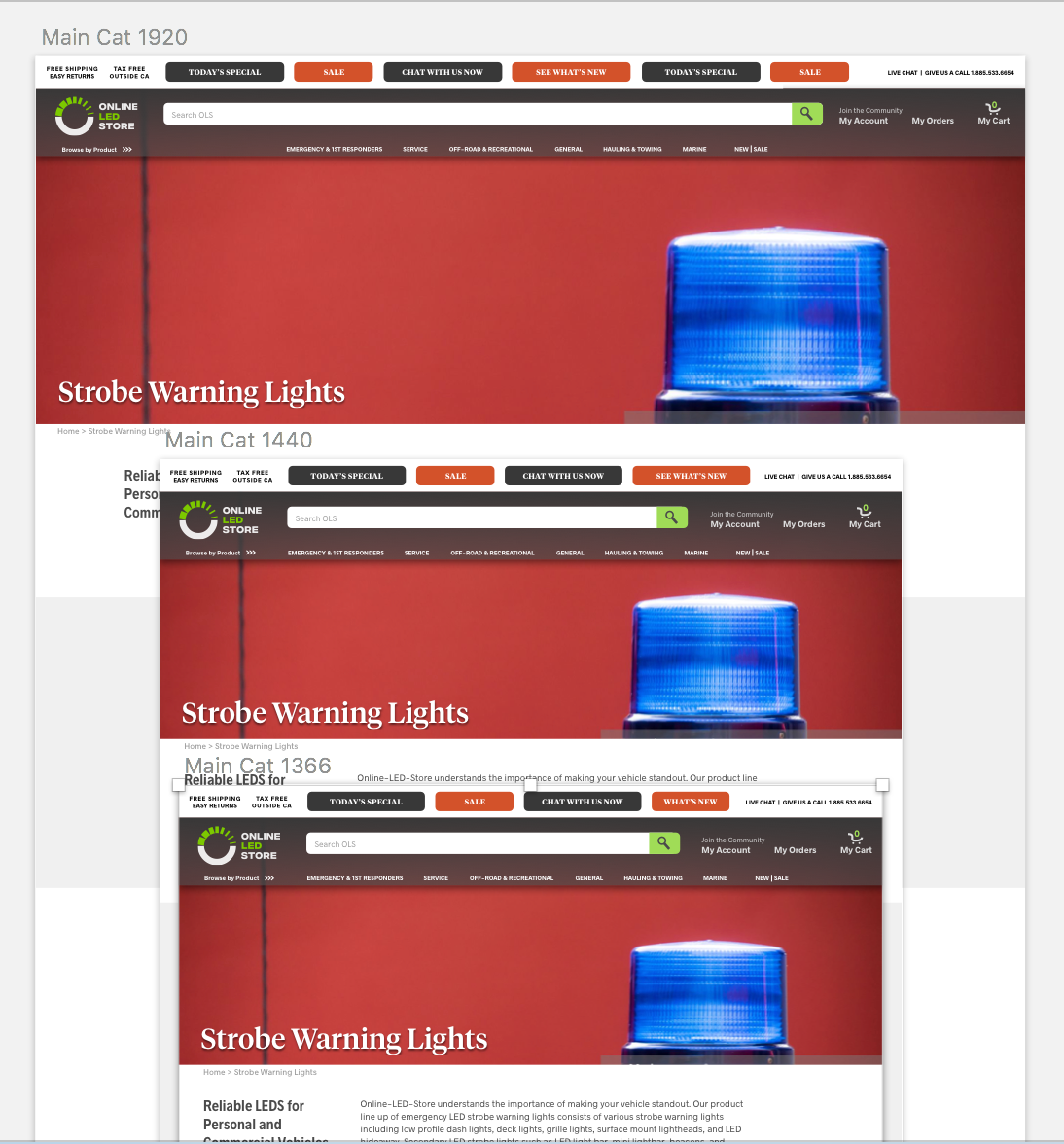
Responsive Design Demo
People often think UX | UI and product designers are web designers. My clients always expected that out of me. Having a background in advertising, we mocked up things all the time, did graphic design work as an ideation and concept so that specialized designers could execute the project on another higher level.
That being said, I started to teach myself web design, web typography, and started to learn front-end web development: HTML, CSS, JavaScript. I'm still learning everyday, I'm not the best I have to admit, but now going into new projects, I'm could see a huge improvement and I know I could do better.
- Phase 4: Post-Launch, Bug Sweep, QA, Version 2, New Features -
In progress, but already launched new features for update no. 2 while fixing bugs and fine-tuning designs visually and aesthetically.
Appendix: Additional Photos and Documents
Process Photos: Affinity Diagrams, Card Sorting, and Competitive Analysis