Figure 1: User-informed Website Innovations. Our ED.gov redesigns reflect user insights through a modern design process that will benefit ED in a future procurement.
I. Introduction
We want the best possible website for the U.S. Department of Education, and we welcome the opportunity to suggest innovations and process insights through this application based on our work with Fortune 500 companies.
I was the sole product designer tasked to embrace the user experience (UX) mindset and supporting UX methods and tools for the modernization of this information / content hub. I had to educate clients, business development, and partners that this approach to product design reduces risk, cost, and delivery time. We chose to implement this product within the Drupal content management system since government technology requires easy maintenance for its users. I teamed up with a content strategist and a team of five developers for this project.
For every innovation and quality improvement we considered, we sought to evaluate how it would improve the experience for ED’s key users—the design requirements mainly focused on the front-facing users. I stressed the focus and importance of designing for the content managers who are responsible for efficiently maintaining a quality digital experience within ED.


II. Research and Ideation
While this Challenge emphasizes evaluating high-fidelity designs, we recommend that all innovations and design improvements are ultimately rooted in documented user needs and pain points. To minimize risks with the modernization efforts, we suggest that UX research is required through the ED.gov procurement before functional requirements and designs are finalized.
Research Approach
Reflecting Challenge constraints for access to user groups, we elected to interview six people (two parents, two students, a researcher, and a nonprofit representative) who use ED.gov for personal or professional reasons. This helped us to develop empathy for users and understand some of their key behaviors, motivations, and needs. We also spent two days assessing website analytics and heat maps and documenting current information architecture and content.
In the absence of richer interviews, focus groups, co-creative workshops, and other UX research approaches to document user needs, we focused on developing reasonable assumptions so we could tailor approaches to their needs.
III. CREATION of Proto-personas
Informed by this research and information in the Challenge brief, we developed three proto-personas (based on assumptions) to guide design decisions. To inform a full redesign effort, we would suggest adding personas and expanding on/validating these existing personas.
Primary Persona: Personal User
This persona includes students and parents. Students are generally ages 17-24 and tech-savvy. We assume that they’re interested in financial aid topics, including applying for loans or grants, financial guidance, and information on repaying loans. Parents will often have children in K-12 and be interested in helping teens to finance higher education or evaluate school quality and outcomes. We expect that their needs reflect student age and follow common patterns throughout the calendar year.
Anticipated pain points include reading through information that is not relevant and difficulty navigating through the site, finding content, and finding recent updates.
Once these users receive information they need, they are less likely to return. Since these users also generate the most traffic and visits based on site analytics, relevant content for them should be prominently displayed and easy to access. A positive experience at ED.gov for this set of users will also have a high impact in improving trust in the ED brand.
Secondary Persona: Professional User
This broad group uses the website or its subdomains for their work. These users typically include press, educators, administrators, state and local officials, researchers, nonprofit and community organization representatives, and advocates.
Anticipated pain points include difficulty finding niche content and frustration in filtering through content that does not pertain to the specific user.
These users are less likely to abandon the website in favor of third-party resources because of its essential role for their work. As such, they are also more likely to learn and remember how to use and navigate the product. Regardless, information architecture should be refined for each user group to improve their experience.
Ancillary Persona: Internal Ed User
The challenge includes the caveat “among others” when describing a list of key user groups. We chose to add the employees who use the Content Management System users to support edits and content changes. The design choices we make early on will affect the ability of ED employees to keep the site updated without dramatically affecting the quality of the site design or user experience over time.
Ideation
Guided by these personas, I developed a list of potential innovations and quality improvements. I converged on ideas by reviewing them with our original research subjects and discussing them with several leaders of ED’s web-focused contracts. The team then prioritized a final list of improvements to balance innovation, quality, and accessibility priorities of the product requirements and specs.
Guided by these personas, I developed a list of potential innovations and quality improvements. I converged on ideas by reviewing them with our original research subjects and discussing them with several leaders of ED’s web-focused contracts. The team then prioritized a final list of improvements to balance innovation, quality, and accessibility priorities of the product requirements and specs.
IV. My Design Approach
ED.gov is a complex content and information hub. As such, the structure of information is critical to informing design and development. Before developing and iteratively testing prototypes, I invested in ED.gov’s Information Architecture to focus on simplification, aiding reduction of clutter, focusing text, and limiting user tasks and required clicks. These considerations increase engagement, improve navigation, and enhance the user experience.
Site Map and Site Layout
Reflecting user goals, I divided navigational elements into individual content buckets to substantially remove similar calls to action and reduce cognitive overload.
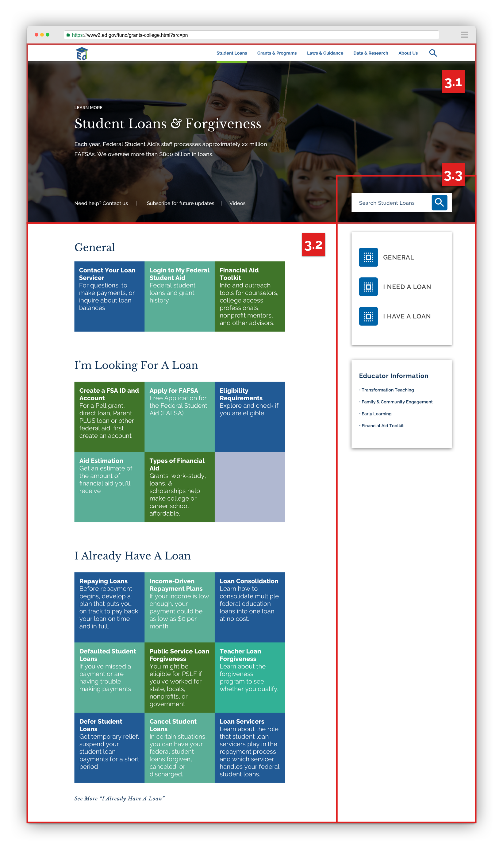
I proposed several top-level categories for site navigation: Student Loans, Grants & Programs, Laws & Guidance, Data & Research, and About Us. Content groupings and specific language to describe each category may evolve based on further user research efforts.
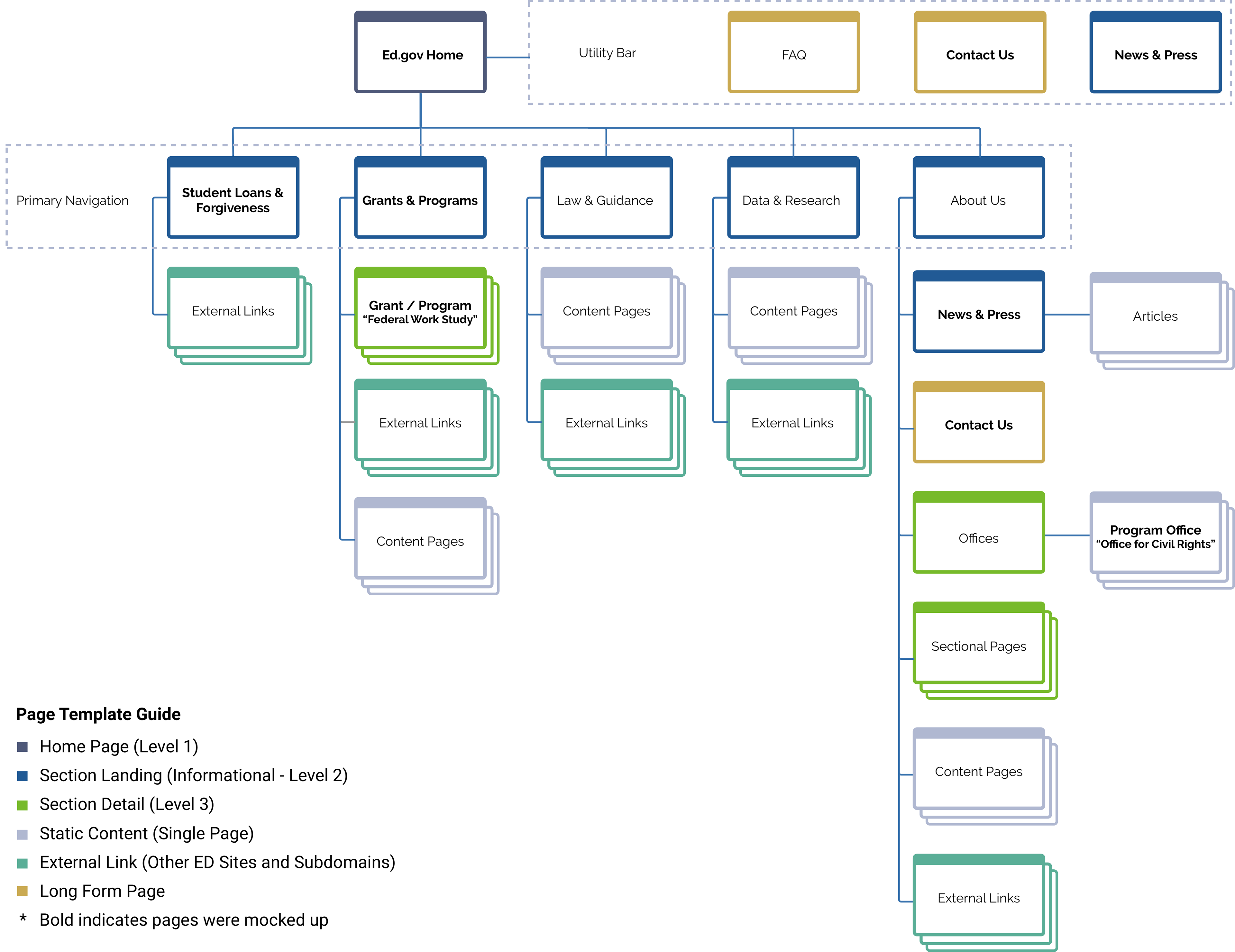
Figure 2: Streamlined Sitemap and Templates. A thoughtful approach to Information Architecture makes the site simpler to navigate and easier to manage.
Prototyping Content Structure for Each Page
Clicking a category on the header navigation expands to a full screen “mega menu.” This innovation draws inspiration from an outline: content is grouped under distinct headers, which enable users to easily scan and access content based on the way they think about their own needs. Prototyping Content Structure for Each Page
Embracing the idea of rapid prototyping, testing, and learning, our design team developed an increasingly high-fidelity set of Challenge wireframes and mockups pages by balancing feedback from subject matter experts and our Drupal development team. The results of this process are highlighted in the section on High-Fidelity Mockups.
By strategically placing innovations on each page, we hope to draw attention to key content and features, promote scrolling behaviors, and create eye movement toward content that is most relevant for the user.
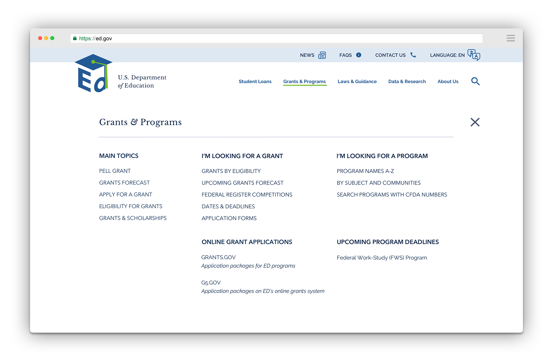
Figure 3: Mega Menus Expose Key Information. We highlight important resources and group them in ways that are easier for our design personas to understand and access.
V. Visual Design
In the client requirement's spirit of innovation, we gently push the boundaries of the ED brand. As we moved from the development of content blocks to the design of high-fidelity mockups, we saw an opportunity to better emphasize ED’s mission and highlight its impact.
Since ED.gov is a content and information hub, we draw inspiration from modern architecture, museums, and libraries to elevate an elegant, unique, and clean aesthetic. Our design elements are innovative, while staying true and consistent with ED’s design direction. They embrace minimalism and modernism to aid navigation and legibility of a quality site experience.
To expand and strengthen our color options, we pair ED’s existing colors with a clean, modern, playful, professional, and earthy palette. New colors are inspired by libraries and books.
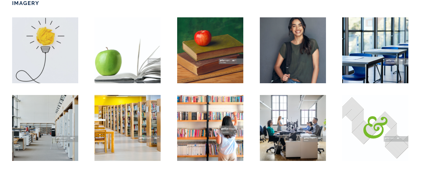
Figure 4: Strong Branding Look and Feel. We reviewed and compiled an image library that reflected the unique characteristics of ED’s mission.
For typography, we recommend a tailored font pairing that strengthens the ED brand without sacrificing accessibility, readability, design quality, response and load time, and user privacy and security. Specifically, we envision bold, elegant, and contemporary:
Display: Libre Baskerville is the modern version of an old-style typeface of a similar name. This serif font was used commonly in literature and news. It makes a powerful statement and promotes trust and credibility. To fully showcase typographic knowledge and take advantage of this font’s beauty, we set ampersands and letters with a tail or descender in italics within headers. If necessary, Merriweather (endorsed in the US Web Design System) can replace this font but we believe this will sacrifice some of its personality without offering incremental value for ED or end users.
Copy: We pair this font with Raleway. This font family has tremendous versatility with weights and styles. This is a clean, user-friendly, and futuristic sans serif typeface used to set copy and paragraphs with a balanced blend of old-style figures and modern appeal. It was designed to be gentle on the reader’s eye and maximize legibility on all devices and sizes. If necessary, Public Sans (endorsed in the US Web Design System) can replace this font but we believe this will sacrifice some of its personality without offering incremental value for ED or end users.
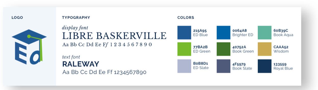
Figure 5: Improved Color and Typography. We expand on the existing ED brand guide to offer an engaging visual vocabulary.
VI. High-Fidelity Mockups
The following pages highlight the specific innovations and quality of design improvements in our high-fidelity (hi-fi) mockups. These can also be reviewed in detail in the provided links.
With ED.gov’s complexity, a full redesign could involve up to 30 templates. Through our submissions, we show how to maximize one design system to offer diverse, user-friendly templates that focus on information search, discovery, and engagement.
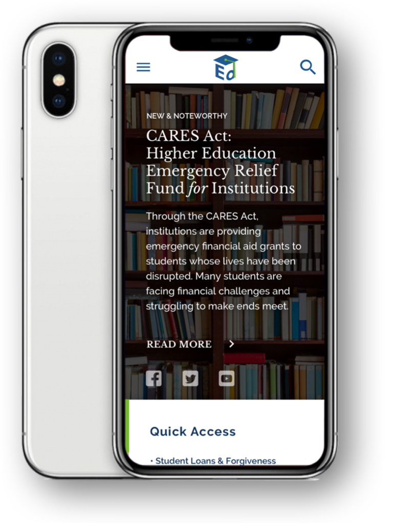
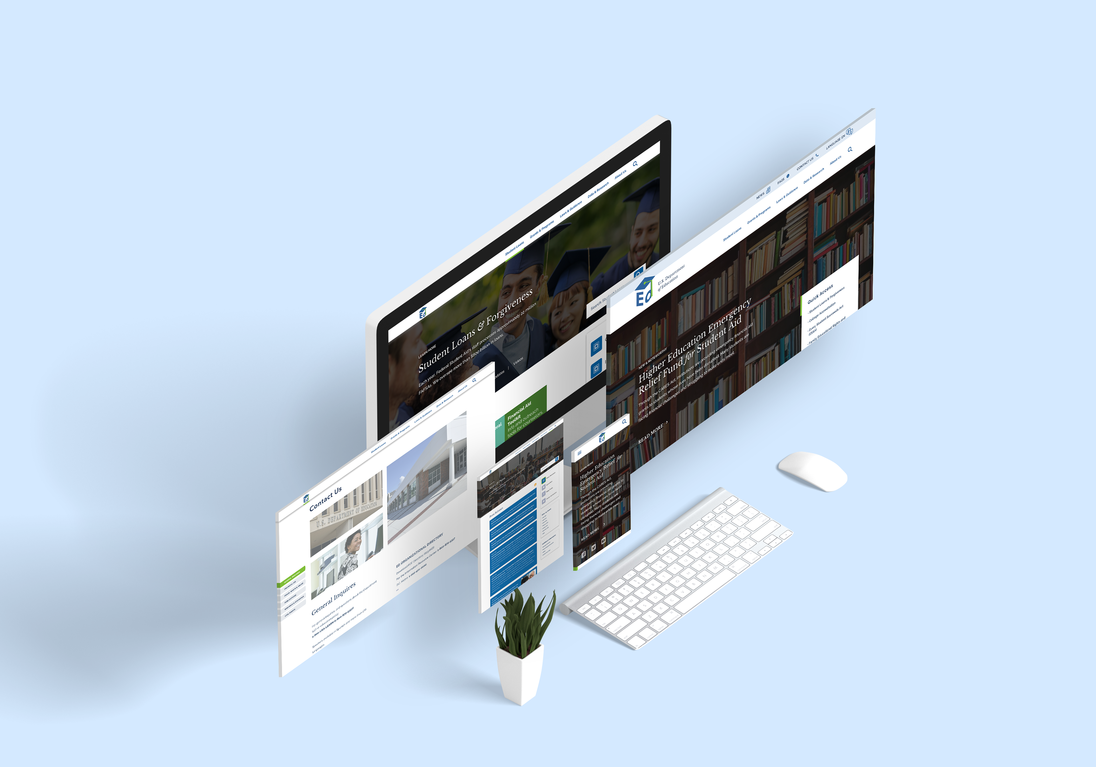
Figure 6: Mobile-First Design. Web elements adapt to each device and screen.

1. HOME PAGE
BOX 1.1: GLOBAL ELEMENTS
• ALERT BANNER. ED’s CMS users can add or update alerts easily. Front-facing users can read, click links, and dismiss alerts.
• UTILITY BAR. Easily add tools and secondary actions and content.
• GLOBAL NAVIGATION. Elements are overlaid using a pleasing but non-traditional layout. The green underline helps identify the current site location, as establishing orientation is important to reduce confusion; with a wide variety of users, each nav item should also attract user attention. To help navigate the site, we include later options for Mad Libs, a Chatbot, and Global Search—with its own mega-menu.
BOX 1.2: MAIN HERO
• CAPTIONS allow CMS users to add optional captions, dates, or notes to any section easily.
• HIGHLIGHTED CONTENT. For important, time-sensitive, or widely used content, add a new hero slide with title, copy, and call to action.
• SOCIAL MEDIA accounts are prominent.
• IMAGE / VIDEO. We offer the option to use a static image, gif, or even short video to draw the audience in without impacting load time.
• QUICK ACCESS LINKS. Content would be time-based and relevant. Analytics show that frequently visited pages are often tied to specific events or dates (CARES Act, FAFSA, etc.).
BOX 1.3: TOOLS & RESOURCES
This section helps users to address their most common needs/goals using colors and bold icons as innovations to draw attention and break up the page. Links would direct users to landing pages with multiple resources and links. These would not be tied to events or dates, as the Quick Access section above.
BOX 1.4: SECONDARY SECTION
To meet use cases beyond 1.3, we added a Mad Libs search feature. This also helps to expose common content options beyond those featured in Common Tools. A “Did you know?” section adds personality and increases interest in ED.
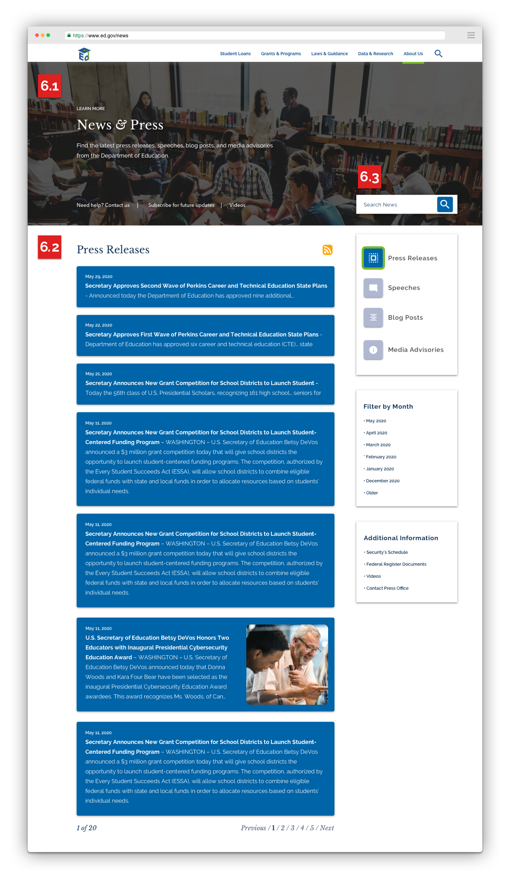
BOX 1.5: NEWS & PRESS
Highlight important updates to users and make it easier to scroll, explore, and discover.
BOX 1.6: LEADERSHIP
Highlight key members of the ED leadership team. This section adds personality, builds trust, and provides a transparent experience. Beyond press updates, amplify messaging for the Secretary and her/his team, and promote their official social accounts.
BOX 1.7: BIG FOOTER
• MAIN CONTENT We chunk content for easy review. Main topics are also reflected in mega menus.
• ED SOCIAL MEDIA ACCOUNTS
• EMAIL SUBSCRIPTIONS Users can sign up for email updates specific to their interests, reflecting ED content strategy.
• BRAND CONTENT Emphasize ED’s branding: its seal, values, and mission statement.
• ADDITIONAL LINKS Legal, Quality, and Security information can be placed in this bar.
• FEATURED CHAT BOT (Fixed at the bottom right of the screen when scrolling) Chatbots are a growing best practice. As envisioned, this would support a global site search without concern for routing to the appropriate help desks.

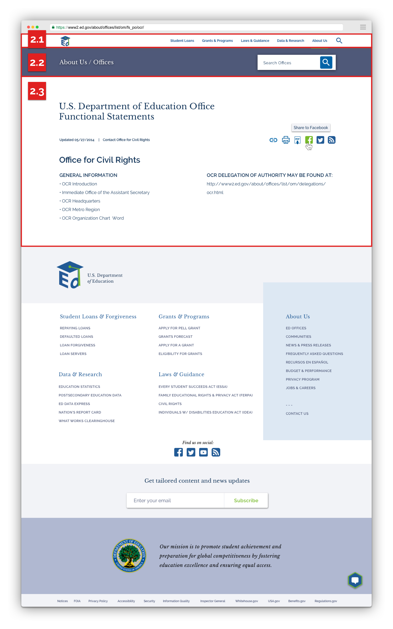
2. PROGRAM OFFICE PAGE: “OFFICE FOR CIVIL RIGHTS”
[TEMPLATE: SIMPLE STATIC CONTENT]
BOX 2.1: INTERACTIVE FIXED HEADER
The homepage mockup features the alert and default header. Once the user scrolls down, the header shrinks to a minimal and less-distracting form. This maximizes reading space and visible real estate, providing users full access to key navigational elements and other site features.
BOX 2.2: COMPACT SECTION HEADER
• Navigational elements such as a two-step breadcrumb reduce time to navigate and improve orientation in deeper pages.
• To support content discovery, the primary search option allows users to search for relevant content within a focused content bucket. Global search remains in the top navigation.
BOX 2.3: MAIN CONTENT
• OPTIONAL MAIN HEADING “U.S. Department of Education Office Functional Statements”
• OPTIONAL MAIN HEADING “U.S. Department of Education Office Functional Statements”
• CAPTIONS & ACTIONS Includes options for a “recently updated” date, additional links, and actions. Current actions are copy to clipboard, print, save as pdf, share to Facebook, tweet, send with email, and access RSS feed.
• CONTENT TITLE “Office for Civil Rights”
• RICH TEXT FIELDS “General Information” Easily add, delete, or format copy, headings, and font styling.


VII. Accessibility and Standards
We include accessibility as a core component of our design process. We reflect modern standards and best practices so that all user groups can easily access ED.gov.
21st Century IDEA Act and US Web Design Standards
The functionality and behavior outlined/showcased in prototype links showcase how applying the design system inherently supports usage across normal desktop/mobile interactions as well as keyboard navigation and screen reader technologies.
The functionality and behavior outlined/showcased in prototype links showcase how applying the design system inherently supports usage across normal desktop/mobile interactions as well as keyboard navigation and screen reader technologies.
Accessibility
Our ED.gov design system is built to be accessible to all user groups. For the purposes of the prototype, we have taken into account the key areas of Accessibility to support the tools and technologies that users with disabilities use:
Our ED.gov design system is built to be accessible to all user groups. For the purposes of the prototype, we have taken into account the key areas of Accessibility to support the tools and technologies that users with disabilities use:
Screen Reader (vision and cognitive)
Screen Magnifiers (low vision)
Voice Recognition Software (mobility impairment)
Keyboard
Closed Captions (hearing and cognitive)
Hearing Aids (hearing)
We also took other considerations into account:
Content flow on the page is top to bottom, left to right.
Content location remains consistent throughout screen sizes and devices.
Headers and Navigation Elements are present and descriptive.
Call to Actions are clearly labeled and follow an “Action Object” labeling convention.
Color contrasts follow ADA guidelines for all elements of the page.
Accessibility Tools have been incorporated, such as the font resizer.
VIII. Additional Considerations
We suggest the following technology and methodology recommendations for a procurement that results in an innovative, high-quality, and accessible website.
Follow a UX Approach—Not Set Design Requirements
Instead of using Challenge entries to inform specific design requirements, we sought to recommend a modern approach to design informed by a deep understanding of the user. ED.gov supports many needs for its stakeholders, and this approach will be extensive for the full site redesign. Through a process of deep user research, ideation, and rapid prototyping, the next ED.gov will better align with user needs. We would be open to elaborating on proposed methodologies.
Embrace Atomic Design
By using an atomic design system, which breaks down all web design elements into a library for ease of use and adaptation, ED will ensure that the website redesign promotes quality and consistency across the platform.
Atomic design principles are not just applied to the way a designer builds their mockups: they map directly into the CMS application and are followed throughout the software development lifecycle. For our interactive prototype, we applied atomic design principles to the Design Process, including wireframes and mockups; Content Modeling, which informs the backend CMS; and a Living Style Guide, which integrates into Drupal.
Reusable, Consistent, and Scalable. Our design system has been built starting with the smallest pieces and combining them together to create larger components, templates, and pages. This inherently promotes brand consistency. All components are re-usable so that ED’s content authors can customize templates and pages to any use case.
Rapid Prototyping. In the spirit of UX design and testing, this approach allows us to rapidly prototype and build out features and interactions which behave exactly like they will when integrated to the platform. This enables rapid development and behavioral testing across browsers, devices, and assistive technologies by removing the dependency on the full CMS implementation.
Easy to Use and Maintain. Users understand what to expect and how to interact with the site. Using reusable layouts and components also translates directly into the website build: ED’s content authors have the necessary flexibility to adapt pages and update content, while the site owner can add new elements, components, or templates once and apply updates everywhere. This prevents degradation of experience following the new site launch and allows ED to test adding new innovations through a cycle of continuous improvement.
Choosing Drupal
We selected Drupal for the ED.gov Challenge because we believe strongly that it offers the best fit for supporting an innovative and quality site experience at scale. Consider its value in:
Enforcing Quality. Enforcing code quality results in a higher quality site and promotes consistency. Drupal effectively utilizes modern development tools to enforce quality standards throughout the application, starting with the code and ending with the user-facing experience across devices.
Deployments. Drupal provides a comprehensive configuration management system which allows updates to be deployed between environments in a repeatable manner, ensuring consistency and quality. Code updates will be automated in a way that the process is repeatable and removes the need for manual intervention and user error.
Maintainability. Beginning with Drupal 8, the platform went to a semantic release cycle, which provides a clear upgrade path from one version to another. Specifically, Drupal 9 was released and there is a clear upgrade path from Drupal 8 to Drupal 9 that does not require a complete site rebuild like previous versions (ie. 6 to 7 and 7 to 8). This allows ED to embrace ongoing investment and user testing without a concern for changing the system dramatically during the next procurement cycle.
We would welcome the opportunity to elaborate on these points and discuss additional considerations, including security, the value of clear separation of content and code, lower long-term cost of ownership, and respective approach to customizations.
Drupal has thousands of modules. With ED’s review and support, we also propose two modules to support innovations and enhance the quality of experience for front-end and back-end users:
AB/JS. This A/B testing module for Drupal allows for testing of alternate experiences, which can be measured to test out improvements to UX on the website.
Smart Content. This is a personalization suite of modules in Drupal which allows sections of content to be tailored to users.
Require a UI Component Builder
This approach allows for additional checks to ensure the level of compliance for accessibility is maintained from design through implementation and launch. It also streamlines the cycle of web design and development. We use the Emulsify Design System, an open-source UI Component builder library which allows front-end developers to implement design systems. Our design system is built on Storybook and it has been adapted to integrate with Drupal 8/9. Emulsify provides several key features for front-end developers such as its built-in a11y accessibility checker, webpack dependency management and strong integration to the Drupal theming layer.